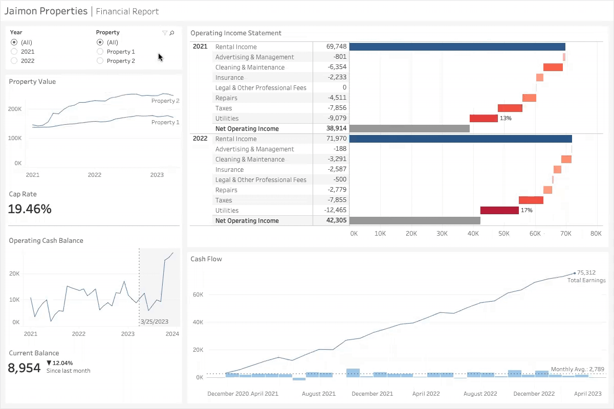
OVERVIEW
This dashboard is designed for a small real estate investment company to monitor financial metrics, such as net operating income and cash flow.
The visualizations help users gain insights into the company's performance that may not be immediately apparent from soley numbers.
OBJECTIVES
- Identify cost-saving opportunities.
- Analyze trends to allocate future investments.
- Provide a financial health summary of the business.
SOFTWARE & LANGUAGES
Tableau, VizQL
KEY FEATURES
- Waterfall chart that graphically represents the company's income statement.
Users can quickly identify cost-saving opportunities with bar length and corresponding color intensity.
- Time-based graphs of historical data and forecasts.
- Filters for properties and years, for users to isolate data relevant to them.

CONSUMPTION DASHBOARD & RISK DASHBOARD
Intel, 2022
The nature of this work is confidential.
Designed and developed interactive Power BI dashboards to identify underutilized manufacturing equipment.
Ensured the consumption of cost effective alternatives, and tracked inventory risk based on inventory and consumption pattern data.
SOFTWARE & LANGUAGES
Power BI, DAX, SQL
KEY FEATURES
- Utilizes SQL and DAX queries to extract data from SSAS, Teradata, and SQL Server databases
- Reconciles cost, inventory, and consumption data
- Configurable by date interval, tech node, and site

PRODUCTION ALIGNMENT DASHBOARD
Mars Wrigley, 2023
The nature of this work is confidential.
Consulted an operations team at Mars to build a Power BI dashboard and find misalignments between planned orders and scheduling data
for Skittles production.
Identified potential root causes, communicated the data analysis, and guided stakeholders to understand dashboard capabilities.
SOFTWARE & LANGUAGES
Power BI, DAX
KEY FEATURES
- Key performance metrics and a benchmarking tool to give users a high level view of goal progress and action items
- Reconciles planning, scheduling, and production rate data
- Configurable by production site and product type
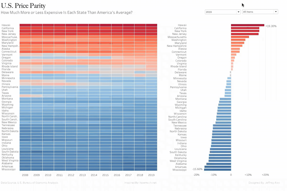
OVERVIEW
Regional price parities (RPPs) measure the differences in price for everyday goods and services across states for a given year, and are expressed as a percentage of the overall national price level.
Economists use RPPs to compare the cost of living between different states.
In 2019, states with the highest RPPs were Hawaii, California, and New York. States with the lowest RPPs were Mississippi, Arkansas, and Alabama.
SOFTWARE & LANGUAGES
Tableau, VizQL
KEY FEATURES & FINDINGS
- Heat map allows users to identify RPP changes over time.
States like Oregon have clearly grown to be more expensive than the US average, while Arizona and Illinois have done the opposite.
- Vertical bar graph shows each state's RPP relative to the national average.
In 2019, Hawaii was about 3% more expensive than the next three most expensive states –– California, New York, and New Jersey.
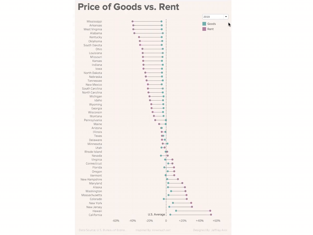
OVERVIEW
Rent prices vary significantly across the United States, while the price of goods between states remain close to the US average.
In 2019, while California led rent prices at over 50% above the US average, it was the fourth most expensive state for goods –– just 5% above the national average.
Arizona saw the least discrepancy in prices of rent and goods with respect to the US average, both at about 5% below the US average.
SOFTWARE & LANGUAGES
Tableau, VizQL
KEY FEATURES
- Dumbell chart visually represents the difference in price of goods and rent with respect to the US average.
- Users are able to select the year of their choice to see changes in the data over time.